As pro cycling teams start to release their new kits for the forthcoming season, Blazin' Saddles goes all Gok Wan on what we can expect in the peloton in 2014.
There have been a flurry of activity in the saddle sartorial stakes this week with Astana, BMC, FDJ and Omega Pharma-Quick Step all releasing images of their kits for the new season. In most cases it's a case of plus ca change, with no team yet to unveil a real corker. Let's take a closer look...
Astana
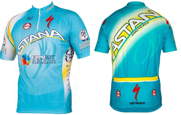
Giro d'Italia winner Vincenzo Nibali and his Astana team-mates will be pedalling around Europe and other further flung places in pretty much an identical kit to the 'Grown Men In Pyjamas' model that we have become well acquainted with since the demise of Liberty Seguros.
In fact, the only perceptible change to the distinctive baby blue number is the addition of an advert for the Expo 2017 right on the front, underneath the team logo.
Expo 2017 is a global exhibition which will focus on the theme 'Future Energy and Global Sustainability' - which is handy, because the team kit is more effective than any solar panel.
Only two candidate cities applied to host Expo 2017, with Kazakhstan's capital Astana ultimately chosen over Belgium's third city, Liege. The exhibition is expected to attract more than two million people to its pavilions from June to September 2017, which is a lot of potential kit sales...
Blazoned across the back of the jersey in a loud, diagonal fashion, the team name serves as another reminder (if the baby blue wasn't enough) that this is the Astana Pro Team. Although it seems like they ran out of space for the final 'A' and so it just reads 'Astan'. Either that or Nibbles and his cronies will be riding around with a rogue 'A' on their right shoulder.
Style: 3 Visibility: 10 Global sustainability: 8 Chances of becoming a classic in the years to come: 8 Shorts would look good with: a maillot jaune but not much else
BMC
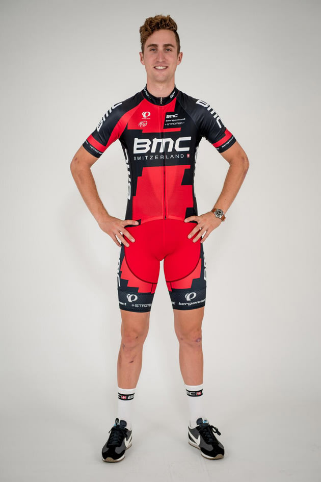
The Swiss-funded American team have clearly gone down the route of not wishing to change a winning formula - which rather erroneously implies that the old kit was 'winning' in the first place. It's still designed by the Japanese-inspired US sports brand Pearl Izumi, which is about the most exotic thing going for it.
You have to give them credit for having a distinctive kit, mind; and the black-and-red patchwork design, although clearly lacking any kind of concept, is certainly easier on the eye and more stylish than the day glow of Astana.
The team released some pictures of Taylor Phinney modelling the 'new, old' kit (as aptly described by Saddles' some-time Eurosport colleague Jose Been). BMC were clearly hoping that Phinney's aero-side-bouff of a new hairstyle would distract fans from the fact that very little had changed.
It does seem that there are two interchangeable varieties of shorts, however: while Phinney is sporting a perceptibly darker red area around his groin, other leaked pictures show the de-rainbowed Philippe Gilbert parading his package in black.
Style: 6 Originality: 6 Chances of becoming a classic: 2 Shorts would look good with: the Vuelta red jersey, which is a shame
Omega Pharma-Quick Step
It would be a case of 'back to black' for Omega Pharma-Quick Step had the Belgian team ever been black in the first place. Gone is last year's slick white and pale blue jersey in favour of a Sky-style black top with a white vertical panel for sponsors and a pale blue collar. Perhaps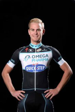 this is something to do with Mark Cavendish and Rigoberto Uran being home-sick - or it could be Patrick Lefevere's take on the marginal gains ethos of Sky.
There's really not much to say about this kit other than stress how rubbish it is. The colours are boring, the style is tacky and it's only going to confuse team identification within the peloton now, what with Sky, IAM and Colombia also sporting pretty much near total black. The only plus point is the retaining of the black bib shorts - which thankfully leaves more to the imagination than some of the more garish kits out there.
Style: 2 Distinctiveness: 3 Chances of becoming a classic: about as much as Cav winning a classic Shorts would look good with: the maglia rosa
FDJ
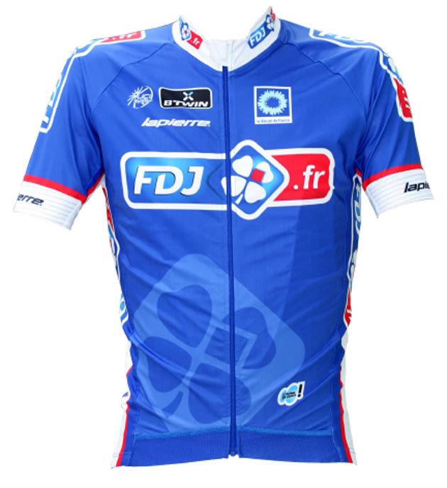
If Carlsberg made cycling kits... Once again, the FDJ riders will look the pick of the bunch with this stylish jersey which channels the famous Tricolor flag of France. If you're going to do blue then this is the kind of easy-on-the-eye shade you're after. It did take a bit of getting used to when FDJ swapped their habitual white colours for blue last season - and some traditionalists will still retain a soft spot for the old style - but there's no denying that this is a thing of beauty.
On the back, instead of a the sponsors' name written across at a jaunty angle, the team have opted for the famous four-leaf clover symbol of France's national lottery, and it looks all the better for it.
Style: 7 Colours and concept: 8 Chances of becoming a classic: 6 Likelihood of being the peloton's best: 9 (until Movistar release their kit) Shorts would look good with: the team jersey, which is a bonus not to be underestimated
Orica-GreenEdge
No one has see this as-yet-undesigned kit but the hot news off the press is that the Australian team have dropped Santini and signed on with Swedish sports brand Craft. It's lucky that they didn't go with Kraft, or the team would be riding around covered with slices of processed cheese.
A new kit will be unveiled ahead of the 2014 Tour de France. Presumably it won't stop as much traffic as their team bus in Corsica.
RusVelo
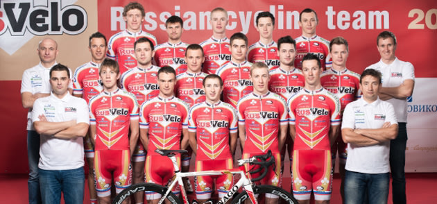
The Russian pro-continental team have totally revamped their kit for 2014, doing away with the blue shorts and predominantly white jersey to bring in a red kit that firmly belongs in the 90s - much like most Russian hair styles. An alarming addition is the double golden arrow motif that covers the paunch and suggestively points towards the groin - an open invitation to podium girls if ever there was one.
Vino4Ever
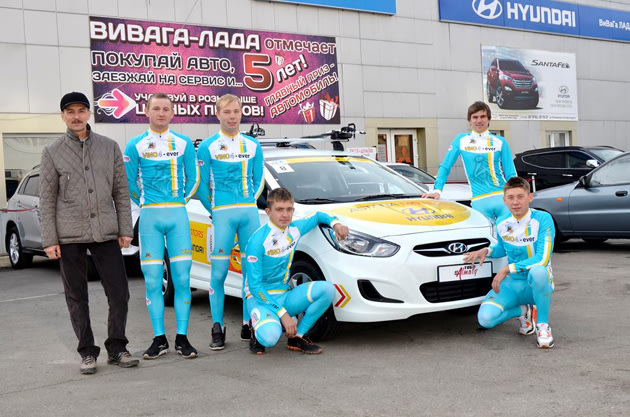
It was announced last week that Kazakhstan was adding a second cycling team to the sport, with the new Vino4Ever outfit joining the UCI ranks as a Continental team in 2014.
While its name may give the impression that the team is cycling's equivalent to a tribute band, this is not an early April's Fool joke. The project really is getting off the ground: named after Alexandre Vinokourov, the team will feature numerous national youth team riders under the stewardship of Vino's former coach, Sergey Kruchina.
Their inaugural kit does little to dispel the suggestion that Kazakhs are both proudly nationalistic and highly unoriginal: it's basically an off-shoot of the Astana baby blue, with just a little bit more white and gold.
Besides showing off the latest trends in former Soviet block moustache trends, a sneak peak at an early team photo certainly enforces the argument that non-black shorts do not have a place in the cycling sartorial world. Indeed, the lamentable amount of bulging contours and scrotal camel toes on display is alarming, to say the very least.
Perhaps the biggest surprise is that the front of the kit does not have a headshot of the man whose inspiration is the driving force behind the team. Although the thought of an upward trouser bulge in the general direction of a silhouette of Vino's face is, frankly, disturbing.
Felix Lowe (Twitter: @saddleblaze)
0 Comment "2014 new cycling kit round"
Posting Komentar